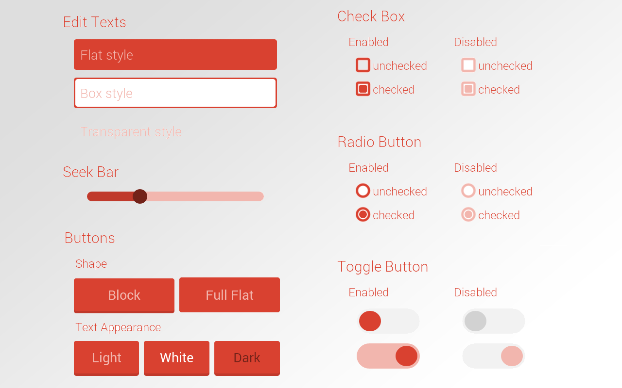
Android FlatUI
FlatUI is a library that lets you use native android widgets with a better and customized look.
You can define the widgets in XML or create on run time in JAVA. Even though the widgets are customized, you can create your styles with attributes.
There are many predefined themes inside this library but you can also use your own colors easily.
!!! There may be some unexpected results with different screen resolutions and different Android versions. If you have some problems or solutions to those problems please let me know.
Features included
- Creating widgets inside XML.
- Creating widgets inside JAVA.
- Using existing and custom themes.
- Using existing and custom fonts.
- Changing theme and attributes at runtime.
- Changing ActionBar theme.
Latest Changes
- Add ease and ripple effects to buttons : 3.0.0
- Fix issue #30 - Merge pull requests #34 (@sherwinrobles), #32 (@aliok), #28 (@weiwelcome0) :2.2.0
- Fix issue #22 - NPE-while-creating-views-dynamically :2.1.1
- Fix issue #14, 15, 19, 26 - Attribute name clash (contribution from @aimanbaharum) :2.1.0
- Fix issue #17 - FlatButton padding applied (solution from @jstefanowski) :2.0.4
- Fix issue #18 - Consecutive activity opening (pull request from @michalbrz) :2.0.3
Widgets
Themes
Including into your project
Add the following dependency to your build.gradle.
dependencies {
    compile 'com.github.eluleci:flatui:3.0.0'
}
Main Java functions
// Converts the default values (radius, size, border) to dp to be compatible with different
// screen sizes. If you skip this there may be problem with different screen densities
FlatUI.initDefaultValues(this);

// Setting default theme to avoid to add the attribute "theme" to XML
// and to be able to change the whole theme at once
FlatUI.setDefaultTheme(FlatUI.DEEP);
FlatUI.setDefaultTheme(R.array.my_custom_theme);    // for using custom theme as default

// Getting action bar drawable and setting it.
// Sometimes weird problems may occur while changing action bar drawable at runtime.
// You can try to set title of the action bar to invalidate it after setting background.
getActionBar().setBackgroundDrawable(FlatUI.getActionBarDrawable(FlatUI.DEEP, false));
getSupportActionBar().setBackgroundDrawable(FlatUI.getActionBarDrawable(FlatUI.DEEP, false));
Using custom colors
You can use your own colors in two ways.
1 - Creating color array in xml and referencing it.
<!-- CREATE A COLOR ARRAY IN COLORS XML -->
<color name="custom_theme_darker">#ad843d</color>
<color name="custom_theme_dark">#d4a14a</color>
<color name="custom_theme_primary">#fbbf58</color>
<color name="custom_theme_light">#fae8c8</color>

<integer-array name="custom_theme">
    <item>@color/custom_theme_darker</item> <!-- really much darker color of main color -->
    <item>@color/custom_theme_dark</item> <!-- a bit darker color of your main color -->
    <item>@color/custom_theme_primary</item> <!-- main color of your theme -->
    <item>@color/custom_theme_light</item> <!-- really much lighter color of main color -->
</integer-array>

<!-- REFERENCE THE ARRAY IN LAYOUT FILE -->
<com.cengalabs.flatui.views.FlatButton
    ...
    flatui:fl_theme="@array/custom_theme" />
2 - Creating color array in java and setting it
int[] myColors = {Color.RED, Color.BLUE, Color.GREEN, Color.BLACK};

((FlatSeekBar) findViewById(R.id.seekbar)).getAttributes().setColors(myColors);
Using custom fonts
Roboto and Open Sans are already included to the library but you can use any font with Android FlatUI. Place your font file in assets/fonts/ folder of your project and use fontFamily and fontWeight attributes to your view. Your font file's name should be formatted like 'fontname_fontweight.ttf'. It is important to name the font file in correct way otherwise the font cannot be created. If your font file is .otf you can use the 'fontExtension' attribute for it.
<!-- default values of the font. no need to use extension if it is already ttf -->
<!-- all the weights of the roboto and open sans are already included -->
<com.cengalabs.flatui.views.FlatTextView
    ...
    flatui:fl_fontFamily="roboto"
    flatui:fl_fontWeight="light"
    flatui:fl_fontExtension="ttf"/>
Attribute list
These are only common attributes for most of the views. You can see the full list of available attributes in attrs.xml
-
fl_theme : theme of the element (reference: @array/themeName)
-
fl_textAppearance : text color on the element. dark or light colors of the theme.(none, dark, light)
-
fl_fontFamily : name of the font family (string)
-
fl_fontWeight : font weight of the text (string) (extralight, light, regular, bold, extrabold)
-
fl_fontExtension : extension of the font. use if not ttf (string)
-
fl_borderWidth : border width of the element. (dimension)
-
fl_cornerRadius : corner radius of the element. (dimension)
-
fl_size : size of the element. (dimension)
Samples
Only showing specific attributes for views.
<!-- Add this line to the root element of the layout -->
xmlns:flatui="http://schemas.android.com/apk/res-auto"

<!-- General Attributes -->
<com.cengalabs.flatui.views.SomeFlatView
    ...
    flatui:fl_theme="@array/sand"
    flatui:fl_textAppearance="dark"
    flatui:fl_fontFamily="roboto"
    flatui:fl_fontWeight="light"
    flatui:fl_fontExtension="ttf"
    flatui:fl_borderWidth="2dp"
    flatui:fl_cornerRadius="5dp"
    flatui:fl_size="20dp" />


<!-- FlatTextView -->
<com.cengalabs.flatui.views.FlatTextView
    ...
    flatui:fl_textColor="main"
    flatui:fl_backgroundColor="darker"
    flatui:fl_customBackgroundColor="#00aff0" />


<!-- FlatEditText -->
<com.cengalabs.flatui.views.FlatEditText
	...
	flatui:fl_fieldStyle="flat" />


<!-- FlatSeekBar -->
<!-- has no special attribute -->
<com.cengalabs.flatui.views.FlatSeekBar
	...
	/>


<!-- FlatButton -->
<com.cengalabs.flatui.views.FlatButton
	...
    flatui:fl_touchEffect="fl_ripple"
	flatui:fl_blockButtonEffectHeight="3dp" />


<!-- FlatCheckBox -->
<com.cengalabs.flatui.views.FlatCheckBox
	...
	flatui:fl_dotMargin="5dip" />


<!-- FlatRadioButton -->
<com.cengalabs.flatui.views.FlatRadioButton
	...
	flatui:fl_dotMargin="5dip" />


<!-- FlatToggleButton -->
<!-- You can create different looks by playing with height, width, size, radius and space -->
<com.cengalabs.flatui.views.FlatToggleButton
	...
	flatui:fl_space="5dip" />
License
Copyright 2014 CengaLabs.

Licensed under the Apache License, Version 2.0 (the "License");
you may not use this file except in compliance with the License.
You may obtain a copy of the License at

   http://www.apache.org/licenses/LICENSE-2.0

Unless required by applicable law or agreed to in writing, software
distributed under the License is distributed on an "AS IS" BASIS,
WITHOUT WARRANTIES OR CONDITIONS OF ANY KIND, either express or implied.
See the License for the specific language governing permissions and
limitations under the License.

